|
|
Post by mrstansell on Mar 17, 2011 18:25:41 GMT -5
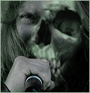
Alright so those of you who actually know who I am will know what I'm talking about here, for the rest of you...sorry but I'm sure you'll catch on. So back toward the end of 2010 I told all you EUW-ites about this movie script of mine that I was working on called "Awestruck." euw23.proboards.com/index.cgi?board=ooc&action=display&thread=4692 Well cut to now and I'm months off from production. I plan on a full update on what's going on with the flick but this post is just to get opinions on a teaser banner. See I'm launching a project for "Awestruck" tonight on Kickstarter.com which helps raise funds for artists, filmmakers, photographers. Pretty much I offer rewards for donating money toward the flick and they donate(btw, I have some incredibly badass lined up) and I need a banner to bring people in. Something to grab them long enough to read about project. Now I've never been good with this photoshop shit but I've created this teaser poster of sorts for the site. Now I'm sorta happy with it but what the fuck do I know? So I'm bringing it to all of you. Be honest because even negative reviews are going to help me. So...what do you think? |
|
F1
Veteran
 Got Girl Problems? F1!
Posts: 985
|
Post by F1 on Mar 18, 2011 4:50:52 GMT -5
I actually happen to think it's badass and not only captures the attention of people who will look upon it but also is applicable to being basically a badass rock album cover. That's the way I see it anyway.
|
|
Skye
Prospect
EUW In-Ring Announcer[/color]
The cake is NOT a lie!
Posts: 578
|
Post by Skye on Mar 18, 2011 7:53:36 GMT -5
I like it!
I agree with F1 - it is reminiscent of an album cover
|
|
|
|
Post by Mr. C on Mar 18, 2011 10:51:19 GMT -5
If possible, I'd even bump the contrast up a little higher, make the bulbs shine a little brighter. The idea is great for catching the eye, I'd just go a little further in making it really pop.
|
|
|
|
Post by primetime on Mar 18, 2011 10:53:49 GMT -5
It has an 80's rock N' Roll vibe to it, so if that is what you are going for then mission accomplished! You are a much better photoshopper than I am though Christian, I am sure in the end you will make eyeballs bleed at the epicness of your poster. (The one you made is simple, but effective thus far)
|
|
|
|
Post by Commissioner Warrior™ on Mar 18, 2011 11:15:21 GMT -5
It's simple, somewhat eyecatching, well made. There's nothing really bad about it. The only problem I foresee is that it doesn't really say a whole lot about the movie. Now that could create an air of mystery. A wonder of "What is this Awestruck Rock Anthology?". If there was something in it other than the title though, maybe a significant place, a controversial saying, a key band, a lead actor, I'm not sure. It's not bad, it just seems like you could have something better.
P.S. - As far as the photoshop work goes, looks smooth clean and awesome to me.
|
|