|
|
Post by primetime on Aug 23, 2010 3:19:23 GMT -5
Alright,
Here is the contest that us image artists look forward to! Do you think you are good enough to design the official poster of Prestige 2010? Here is what is needed..
- The text "Prestige 2010"
- The fed name "EUW"
So, you got time.. start brainstorming now!
|
|
|
|
Post by Deactivated on Aug 23, 2010 19:21:53 GMT -5
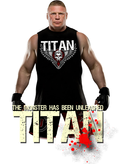
Just a little preview of what I'm working on. This is going off the projected match of Sabora vs. 415 at Prestige. Still have to do a good bit of work but figured I'd throw up my rough draft so far. |
|
|
|
Post by Obi on Aug 23, 2010 23:51:58 GMT -5
Looking good so far, friend! 
|
|
Sabora
Veteran
 The Machine
Posts: 979
|
Post by Sabora on Aug 24, 2010 0:03:38 GMT -5
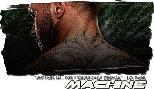
Just a little preview of what I'm working on. This is going off the projected match of Sabora vs. 415 at Prestige. Still have to do a good bit of work but figured I'd throw up my rough draft so far.  |
|
James
Veteran
The EUW's Resident Superhero!
Posts: 917
|
Post by James on Aug 24, 2010 21:48:10 GMT -5
I am not certain, if I like this, but I figured I'd go somewhere other than a crushed 415.  |
|
|
|
Post by Deactivated on Aug 25, 2010 0:17:48 GMT -5
I am not certain, if I like this, but I figured I'd go somewhere other than a crushed 415. That's not bad, good to see that someone else will be competing in this thing. I do, however, believe you may have missed the point of my poster...at least that's what I get from from your "crushed 415" statement. See that is actually the opposite of what I'm saying in my art. Actually what I'm saying is that Sabora may think he's got 415 and the match in the palm of his hand and can take either at any moment...but in reality he may be missing the bad moon that is on the rise. There's an element within the poster that I believe that you and some others may be missing. I won't point it out but I also don't believe that its too hard to miss if you look at the bigger picture. If I'm wrong I apologize. I just don't want it to seem I'm burying 415 when actually I'm doing the opposite and saying that Sabora needs to stay focused. Best of luck to you and anyone else that submits. |
|
James
Veteran
The EUW's Resident Superhero!
Posts: 917
|
Post by James on Aug 25, 2010 0:32:46 GMT -5
't was a joke. Smile.
I know that people aren't going to make a poster designed to put one person down.
I also just noticed the X-Box achievement. Well done.
|
|
|
|
Post by Evan Black on Aug 25, 2010 0:45:47 GMT -5
lol
|
|
|
|
Post by Obi on Aug 25, 2010 1:09:24 GMT -5
I think they both look great! Let me see what I can do. Kevin, I understood the theory right away and think you have some very nice skills. Your banner though is priceless.
|
|
|
|
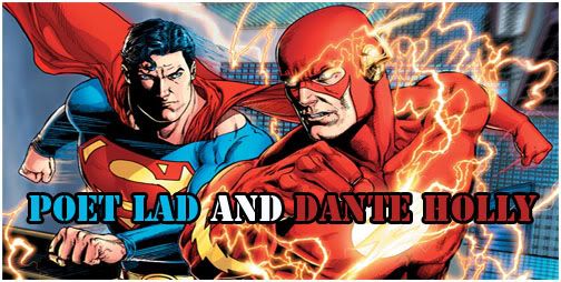
Post by Obi on Aug 25, 2010 1:26:58 GMT -5
 lol, I tried. lol, I tried. |
|
James
Veteran
The EUW's Resident Superhero!
Posts: 917
|
Post by James on Aug 25, 2010 1:35:16 GMT -5
I'm sorry Toby, but when I saw that, I immediately thought ...  I do like the concept though and having tried it before, know it's difficult to pull off well. |
|
|
|
Post by primetime on Aug 25, 2010 2:08:40 GMT -5
And the contest heats up! ;D
It is so hard for me to not get involved in this... lol
|
|
|
|
Post by Diabolik on Aug 25, 2010 4:59:26 GMT -5
I won't point it out but I also don't believe that its too hard to miss if you look at the bigger picture. I just noticed it. I'll hide the text in case people want to guess for themselves. It will be between the [ and the ]. [ 415's face on the moon! ] Very nice touch. Subtle, I missed it at first, but I looked closer and then saw it. |
|
|
|
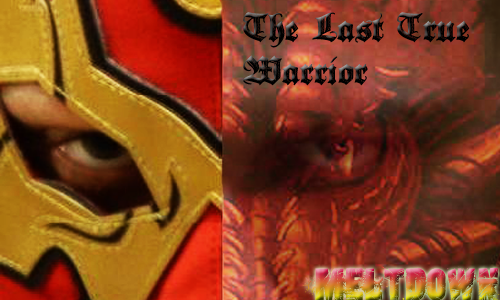
Post by Evan Black on Aug 26, 2010 18:15:49 GMT -5
|
|
|
|
Post by kida on Aug 26, 2010 18:17:22 GMT -5
^ that's it. that's the one. <3 make it happen jaden
|
|
|
|
Post by Evan Black on Aug 30, 2010 3:51:52 GMT -5
i still think its badass
|
|
|
|
Post by primetime on Sept 20, 2010 19:32:00 GMT -5
My Turn.   |
|
|
|
Post by hurricane on Sept 21, 2010 7:28:19 GMT -5
Not 100% happy with it just yet. I'm gonna mess around with the font, especially the main "Prestige 2010." |
|
CJ
Prospect
Booze Head
Posts: 295 
|
Post by CJ on Sept 21, 2010 16:30:34 GMT -5
Damn, all of these posters are sick. you guys have some serious skill. I guess it is time to fire up the old Microsoft Paint!  I kid... I suck at this type of shit. I am good at drinking a pint and judging them though! ;D Great work all around. |
|
|
|
Post by The Sky King on Sept 21, 2010 19:40:38 GMT -5
Loving Jadens work. The Saint George looks way out of place though. Remove that (or blend it into the moon) and the 2nd poster is 100% pure kick-ass.
|
|
|
|
Post by primetime on Sept 21, 2010 19:51:42 GMT -5
|
|


 ;D
;D 
