|
|
Post by dragon on Jul 9, 2009 15:48:17 GMT -5
Throw away those old banners... Time to upgrade!  and champion styled...  And a little darker.  |
|
|
|
Post by Commissioner Warrior™ on Jul 9, 2009 16:00:52 GMT -5
Those look badass, but you know how nitpicky I am. So of course I have something to say. On each one, the main pic of Lincoln needs to be moved up about one pixel, so it doesn't overlap the border on the bottom.
Still, badass.
|
|
|
|
Post by dragon on Jul 9, 2009 16:11:55 GMT -5
|
|
|
|
Post by dragon on Jul 9, 2009 16:16:51 GMT -5
And here is a throwback!  |
|
|
|
Post by Commissioner Warrior™ on Jul 9, 2009 16:21:08 GMT -5
Hmm. I think just over the border would look perfect. Maybe just me though.  |
|
|
|
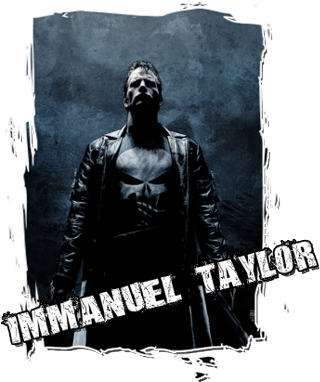
Post by Immanuel Taylor on Jul 9, 2009 16:21:36 GMT -5
Awesome banners. Thanks Xplode! I'm seriously digging the last one, love how dark and monochromatic it is. I don't want to seem nitpicky or ungrateful but can you just add "EUW World Champion" on it and perhaps make both texts sort of old-school texts? You know, like classic fonts similar to my current banner or something like that?
|
|
|
|
Post by Immanuel Taylor on Jul 9, 2009 16:31:02 GMT -5
Actually the last one in the first post. The whole pixel thing doesn't really bother me much. Although I do like the Lethal reference, can you like minimize that and put it somewhere spontaneous? Like under Lincoln's elbow? It'll be cool, you know like sort of an easter egg or hidden aspect of the banner or something like that. Thanks again for the banners, Xplode. I recall when you began using photoshop and now it seems like you've almost fucking mastered that program.
|
|
|
|
Post by dragon on Jul 9, 2009 16:39:47 GMT -5
Ok... I think I got it. I fixed what War pointed out. (Was a Bitch to line up) I added the dark scheme, classic text and a Easter egg.  and here is without the lift. (This one is my favorite) |
|
|
|
Post by Commissioner Warrior™ on Jul 9, 2009 16:45:17 GMT -5
Yeah, that's exactly what I was talking about. And that spot looks perfect now.
|
|
|
|
Post by dragon on Jul 9, 2009 16:49:07 GMT -5
And here is one incase you lose the title one day. (Hey, no one is champion forever)  |
|
|
|
Post by Immanuel Taylor on Jul 9, 2009 16:55:45 GMT -5
The second one is perfect, Xplode. Much appreciated, man and great job, give yourself a quadruple pat to the back.
|
|
|
|
Post by dragon on Jul 9, 2009 16:56:25 GMT -5
|
|
|
|
Post by Commissioner Warrior™ on Jul 9, 2009 17:00:11 GMT -5
That's a helluva look on Daniels' face in that picture. Haha.
|
|
|
|
Post by Evan Black on Jul 9, 2009 17:00:42 GMT -5
 Gave me some inspiration, X. |
|
|
|
Post by Immanuel Taylor on Jul 9, 2009 17:03:42 GMT -5
I have never really noticed it, but Christopher Daniels looks super awesome in a suit. I haven't seen TNA in a while but hopefully they got rid of that ridiculous eye ink he has. And as usual, impeccable work Xplode  |
|
|
|
Post by Commissioner Warrior™ on Jul 9, 2009 17:04:04 GMT -5
As kool at that looks, the far right picture looks like he's taking the center picture in the butt...
|
|
|
|
Post by dragon on Jul 9, 2009 17:04:09 GMT -5
|
|
|
|
Post by Immanuel Taylor on Jul 9, 2009 17:05:23 GMT -5
Just noticed your banner, Evan and it's awesome as well. Love the look on the Daniel's face in the third picture on the right. Lemme see if I can fit it into my sig.
|
|
|
|
Post by dragon on Jul 9, 2009 17:07:40 GMT -5
Gave me some inspiration, X. That is sick E-Black! I love it! you can always see a person's style when they photoshop. Every person has a distinct way in how they do it. Warrior tends to be organized, often using a dominant shade of color. You like to utilize the whole area. Often giving lots of eye candy to gaze upon. I try to switch it up. Right now, I am trying to break the square banner template. I want to bring the image out of the frame. Next, I am going to start animating them with stats, info, etc. Again.. awesome sig! (It does look like the far right guy is poking the center image in the ass) |
|
|
|
Post by Immanuel Taylor on Jul 9, 2009 17:11:58 GMT -5
Whoa I never looked at it that way, Warrior.
Damn, that's nasty. Still an awesome banner. And I actually like the first avatar more, that's officially my pissed off look.
|
|
|
|
Post by Evan Black on Jul 9, 2009 19:42:44 GMT -5
Jesus fuck. Get over it.
|
|