|
|
Post by Commissioner Warrior™ on Aug 29, 2008 22:52:40 GMT -5
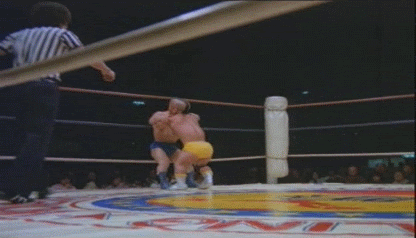
I've never liked lying about something. That cover honestly doesn't look very good. The rough overlay makes it seem amateur and badly created. The text doesn't fit. And it seems horridly out of place. And nothing is blended well at all. Just my honest opinion.
|
|
|
|
Post by Obi on Aug 31, 2008 2:00:10 GMT -5
Yeah, it's rough. I was just throwing shit together. I liked the idea of it but kinda just gave up on it. Oh well.. noble try.
|
|
|
|
Post by wesjones on Aug 31, 2008 14:42:14 GMT -5
FAIL ftw
|
|
|
|
Post by Diabolik on Aug 31, 2008 15:45:58 GMT -5
I actually kinda like it, despite the fact some of the writing blends in with the other pictures and background of the same colour...
|
|
Sabora
Veteran
 The Machine
Posts: 979
|
Post by Sabora on Sept 2, 2008 21:39:39 GMT -5
I thought it was a decent try. I like how you made the image look old and dated. The color of the wording was off. Very cool, none the less.
I never put down other people's efforts in imaging because
1) I suck at it.
2) Art looks different to everyone. So there is no wrong try.
3) I suck at it.
|
|
|
|
Post by Commissioner Warrior™ on Sept 2, 2008 22:00:40 GMT -5
I just never like telling someone something is good when I really don't think it is. I'd never want someone to give me anything other than their honest opinion, so I do the same.
|
|
|
|
Post by Obi on Sept 2, 2008 22:36:40 GMT -5
lol. Let this topic die. I value opinions of any form and honestly, the image was rough. 
|
|
|
|
Post by Mr. C on Sept 2, 2008 22:57:24 GMT -5
BUMP Whaaaat?  |
|