|
|
Post by Commissioner Warrior™ on Jul 29, 2008 19:16:30 GMT -5
|
|
|
|
Post by dragon on Jul 29, 2008 19:20:05 GMT -5
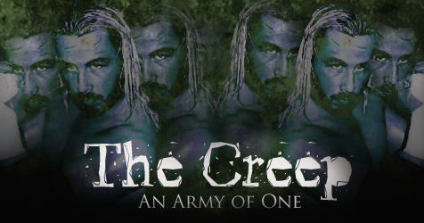
Looks very classy. I sort of like Obi's better though.  Both are good either way. |
|
|
|
Post by Commissioner Warrior™ on Jul 29, 2008 19:24:02 GMT -5
That's only because he's your brother. Haha, just messing with you dude. His is OK. Maybe it's just me, but I don't much like the effect. Or the text. Or the deformation of the EUW logo. But mine is trying to emphasize the classic idea behind Prestige.
|
|
|
|
Post by dragon on Jul 29, 2008 19:26:15 GMT -5
HA, if you judged my actions in Real life based on him being my brother you would think I hate him. (Everyone sais I have little brother syndrome.) Anyway, I like the classy look of yours. Since this one is called "Prestige" I can see why yours would fit better. I am just a sucker for comic book characters!
|
|
|
|
Post by rodriguez on Jul 29, 2008 19:37:24 GMT -5
I was expecting someone's face to be on it  , but I love the classic(mostly easy listening)  |
|
|
|
Post by Commissioner Warrior™ on Jul 29, 2008 19:39:06 GMT -5
I know, there is usually a poster boy. But the few ideas I had for one or more poster boy(s) I didn't love. But when I got that idea, I loved it. And I was amazed by how well it come out.
|
|
|
|
Post by falcon on Jul 29, 2008 20:15:48 GMT -5
I seem to like them both.
|
|
|
|
Post by Evan Black on Jul 29, 2008 23:31:51 GMT -5
Not a fan of the subtext, but other than that...I like.
|
|
|
|
Post by The Creep on Jul 30, 2008 4:33:31 GMT -5
I agree with Black, the render looks good but the text ruins it. Too small and thin.
|
|
|
|
Post by Immanuel Taylor on Jul 30, 2008 8:24:12 GMT -5
Love the poster, but I have to back up Creep and Black regarding the text. Couldn't make out all of it at first.
Perhaps since the poster is meant to be "classic", the text can be plain or something like that.
|
|
|
|
Post by Commissioner Warrior™ on Jul 30, 2008 14:52:45 GMT -5
Ok, but clarify. Just the text at the bottom? Or that and the 'One Night of Classic Wrestling' text? They're the same font, but different outline and put in a different place.
|
|
|
|
Post by Immanuel Taylor on Jul 30, 2008 14:57:57 GMT -5
Ok, but clarify. Just the text at the bottom? Or that and the 'One Night of Classic Wrestling' text? They're the same font, but different outline and put in a different place. I would say both. |
|
|
|
Post by Commissioner Warrior™ on Jul 30, 2008 15:02:35 GMT -5
Ok. I thought about really simple text, but I want a somewhat Retro look. That's what I was actually going for. Gimme a bit though, and I'll try a few other texts.
|
|
|
|
Post by Commissioner Warrior™ on Jul 30, 2008 17:21:23 GMT -5
|
|
Archangel
Prospect
 Back in the Fight
The Avenging Angel
Back in the Fight
The Avenging Angel
Posts: 392
|
Post by Archangel on Jul 30, 2008 17:24:30 GMT -5
last one for me
|
|
|
|
Post by rodriguez on Jul 30, 2008 17:52:28 GMT -5
Second one for me.
|
|
|
|
Post by Immanuel Taylor on Jul 30, 2008 18:00:03 GMT -5
Third for me.
|
|
|
|
Post by Evan Black on Jul 30, 2008 18:10:31 GMT -5
|
|
|
|
Post by Commissioner Warrior™ on Jul 30, 2008 18:12:13 GMT -5
Since everyone likes a specific one, I'm going to make a poll about it.
|
|


 , but I love the classic(mostly easy listening)