|
|
Post by Obi on Jul 1, 2008 1:48:45 GMT -5
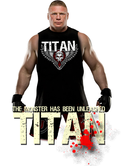
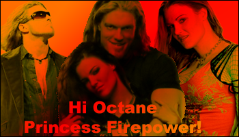
Not sure if I am digging it. And opinions? And..how do you guys blend in the text so it looks natural?
|
|
Hi Octane
EUW Staff  BLUE LANTERN FLASH!
Posts: 684
|
Post by Hi Octane on Jul 1, 2008 1:52:49 GMT -5
A little in your face for Oblivion.
|
|
|
|
Post by Obi on Jul 1, 2008 2:09:41 GMT -5
  any of these? I am bored while i wait for PiV. any of these? I am bored while i wait for PiV. 
|
|
Hi Octane
EUW Staff
BLUE LANTERN FLASH!
Posts: 684
|
Post by Hi Octane on Jul 1, 2008 2:16:28 GMT -5
I Like the yellow one.
|
|
|
|
Post by Obi on Jul 1, 2008 2:22:05 GMT -5
Thanks, I did too. 
|
|
|
|
Post by Evan Black on Jul 1, 2008 3:13:29 GMT -5
The one problem I have with your banners is some of the pictures look stretched out. If you're going to mess the size using the Move Tool, make sure to hold down the Shift key so it doesn't stretch out one way or another. Other than that, they are very professional looking. Good blending, color and layouts. Scanlines aren't my style, but you pull them off pretty well.
|
|