F1
Veteran
 Got Girl Problems? F1!
Posts: 985
|
Post by F1 on Aug 11, 2008 0:38:13 GMT -5
Actually the text is a nice touch and I like how "Saraphim" splits the banner, I think its clean.
|
|
|
|
Post by Commissioner Warrior™ on Aug 11, 2008 7:17:52 GMT -5
Yeah. That was one of the few ways I was able to blend the left and right pics.
|
|
Archangel
Prospect
Back in the Fight
The Avenging Angel
Posts: 392
|
Post by Archangel on Aug 11, 2008 10:38:23 GMT -5
I like it commish but not the writing, just looks too busy stuffed in the one corner. I used Obi's second one as a just for right now. I like the kinda ghostly image but still not completely sold on anything yet. Honestly I figured Brian Adams would have some great stand alone pics from KroniK but I guess those pics got tossed when he passed. Dang and I love him as a poser and especially with Maria. Let me see if I can find some pics of her that I love (but honestly is there a bad picture of her>  ) |
|
|
|
Post by Commissioner Warrior™ on Aug 11, 2008 15:26:58 GMT -5
Yeah. There's a few good pics of Adams, but for one, I can't find any PSD cuts of him. So the picture either has to be blended or you have to cut it yourself. But I'll try a different text on that one and see how it looks.
|
|
|
|
Post by Commissioner Warrior™ on Aug 11, 2008 16:10:15 GMT -5
Tried a diff. approach as far as the "The Time for Redemption has Come" text, so lemme know what you think.  |
|
F1
Veteran
Got Girl Problems? F1!
Posts: 985
|
Post by F1 on Aug 11, 2008 21:00:11 GMT -5
It's a great idea but I don't like the fact that the people are as vague as they are, but then again I think that's kinda what MdA wanted.
|
|
Archangel
Prospect
Back in the Fight
The Avenging Angel
Posts: 392
|
Post by Archangel on Aug 11, 2008 23:42:33 GMT -5
nah that one messes up her face to much and there are pictures of Maria on the wwe site that has her in a short brown dress and well if I could get one of those.....
But the writing is a little too much on that.
|
|
F1
Veteran
Got Girl Problems? F1!
Posts: 985
|
Post by F1 on Aug 12, 2008 7:46:23 GMT -5
If you could somehow get that in the background instead of the foreground, than I think it would be a lot cleaner looking.
|
|
|
|
Post by Commissioner Warrior™ on Aug 12, 2008 17:18:20 GMT -5
Hmm. I can try, but the back pics are all single shots, so it'll be difficult. Lemme see what I can pull off though.
|
|
|
|
Post by Commissioner Warrior™ on Aug 13, 2008 23:25:38 GMT -5
I'm not entirely sure why, but I'm very determined to make this banner look good. lol. So here's another slightly edited try at it.  |
|
Archangel
Prospect
Back in the Fight
The Avenging Angel
Posts: 392
|
Post by Archangel on Aug 14, 2008 9:45:04 GMT -5
I would say on that last one, you can't really read it until the very last one and it's only half of the line. "Redemption has come" on a side note, maria looks hot in the picture  |
|
|
|
Post by Commissioner Warrior™ on Aug 14, 2008 15:24:42 GMT -5
Yeah. But I still kinda like the way it looks. Because it's so backgroundish. I just don't see a lot of ways to make the redemption text work other than doing that, because it ends up looking kinda bunched in the bottom. But if that's your complaint...I shall edit it more, lol.
|
|
|
|
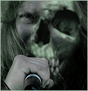
Post by Commissioner Warrior™ on Aug 14, 2008 21:41:01 GMT -5
And here I am...AGAIN!  Eh? |
|
|
|
Post by Mr. C on Aug 15, 2008 7:01:00 GMT -5
Best of 'em all if'n yee be askin'.
|
|
Archangel
Prospect
Back in the Fight
The Avenging Angel
Posts: 392
|
Post by Archangel on Aug 15, 2008 13:30:14 GMT -5
I likey. I just wish I understood PS so I wouldn't have to keep asking you guys  ( |
|
|
|
Post by Commissioner Warrior™ on Aug 15, 2008 13:32:39 GMT -5
It's ok. I really love how that one finally came out. And it has a good bit of depth and layering to it, as a result of the fact that you kept mentioning what you didn't like, lol.
|
|


 )
)


 (
(